


Key Takeaways
- Zebra striping alternates row background colors in tables to improve readability without conveying meaning on its own.
- WCAG 1.4.3 requires text to meet 4.5:1 contrast against its row background for normal text and 3:1 for large text. Stripe-to-stripe contrast is not required when stripes are purely decorative.
- When stripes convey meaning such as grouping or selection, WCAG 1.4.11 applies and the stripe must meet 3:1 contrast against its adjacent background.
- Dark mode and forced-colors mode require separate contrast calculations and structural fallbacks like borders and semantic markup to maintain usability.
- Little Saints applies the same discipline of stated, verifiable values to non-alcoholic spirits with documented mushroom doses and beta glucan content.
Do Zebra Stripes Need To Contrast With Each Other?
Most tables do not need the two stripe colors to contrast with each other.
WCAG 2.2 Success Criterion 1.4.3 Contrast (Minimum) governs the contrast between text and its background, not between two background colors. Its stated intent is to ensure text can be read by people with moderately low vision without contrast-enhancing assistive technology. A row background is not text, so the criterion does not require two stripe colors to contrast with each other.
WCAG 2.2 Success Criterion 1.4.11 Non-text Contrast requires a 3:1 contrast ratio for visual information needed to identify user interface components and graphical objects that convey meaning. Decorative non-text visuals are explicitly excluded. A stripe used only to help the eye track across a row is decorative, conveys no information on its own, and falls outside 1.4.11's scope.
The exception matters when the stripe is the only signal conveying meaning. When banding is the sole indicator of grouping, selection state, or a data series, the decorative exemption does not apply. In that case, WCAG 1.4.11 governs, and the stripe must meet 3:1 against its adjacent background.
Use this rules list for quick reference:
- Stripe-to-stripe contrast (WCAG 1.4.3): Not required. The criterion governs text-to-background contrast only.
- Text on any stripe (WCAG 1.4.3): 4.5:1 minimum for normal text and 3:1 for large text.
- Meaning-conveying stripe against adjacent background (WCAG 1.4.11): 3:1 minimum. Applies only when the stripe is the sole signal of a meaningful state.
- Decorative stripe (WCAG 1.4.3 and 1.4.11): No contrast requirement between the two stripe colors.
The MDN color contrast guidance confirms that the contrast ratio formula, (L1 + 0.05) / (L2 + 0.05), where L1 is the lighter color's relative luminance and L2 is the darker, applies to text against its direct background, not to background-to-background relationships.
What Contrast Ratio Do Table Rows Need? Recommended Values With Stated Ratios
Clear contrast rules prevent subtle design choices from turning into accessibility failures.
Vague guidance like "keep it subtle" conflates two separate concerns. Subtlety is a design preference. The text-to-stripe ratio is a WCAG requirement. The two are frequently confused, and that confusion is why implementations fail audits.
The values below are stated so you can verify them independently using any WCAG contrast checker. If you cannot verify a pair, do not use it.
Light Mode Pair:
- Base row background:
#FFFFFF(white) - Alternate row background:
#F4F4F4(light gray, consistent with Carbon Design System's Gray 10 layer token) - Text color:
#1A1A1A(near-black) - #1A1A1A text on #FFFFFF has a contrast ratio of 17.4:1, which passes WCAG AA and AAA for normal text.
- Stripe-to-stripe (#FFFFFF vs #F4F4F4) yields a contrast ratio of approximately 1.10:1, which fails WCAG AA and AAA. Purely decorative content is explicitly exempted from WCAG contrast requirements under Success Criterion 1.4.3.
Dark Mode Pair:
- In VS Code's Dark+ theme, the editor background (dark surface) hex code is #1E1E1E.
- Alternate row background:
#262626(one luminance step lighter, consistent with Carbon's Gray 90 dark layer token). - Text color:
#F5F5F5(off-white, recommended by Theme and Color's dark mode palette guidance as safer than pure white for reducing halation). - Text on
#1E1E1E: approximately 14.7:1, which passes the 4.5:1 requirement. - Text color #333333 on a #FFFFFF background produces a contrast ratio of approximately 12.6:1, which passes the WCAG AA 4.5:1 threshold for normal text.
The CSS below implements both pairs. The light-mode stripe (#F4F4F4) stays intentionally subtle, while the dark-mode stripe (#262626) steps up in luminance from the #1E1E1E base. The same principle applies in opposite directions.
/* Light mode zebra striping */ tbody tr:nth-child(odd) { background-color: #FFFFFF; } tbody tr:nth-child(even) { background-color: #F4F4F4; } tbody td { color: #1A1A1A; } /* Dark mode zebra striping */ @media (prefers-color-scheme: dark) { tbody tr:nth-child(odd) { background-color: #1E1E1E; } tbody tr:nth-child(even) { background-color: #262626; } tbody td { color: #F5F5F5; } } For Tailwind CSS, apply odd:bg-white even:bg-gray-100 text-gray-900 in light mode and override with dark:odd:bg-[#1E1E1E] dark:even:bg-[#262626] dark:text-[#F5F5F5]. Verify the computed ratios against your actual surface tokens before shipping.
Zebra Striping in Dark Mode
Dark mode needs its own stripe decisions instead of inverted light-mode values.
On a white surface, a #F4F4F4 alternate row reads as appropriately subtle and creates gentle visual separation. On a dark surface such as #121212 or #1E1E1E, the same near-white value becomes a glaring band. The fix is to move the alternate row a small step in luminance away from the base surface, toward a lighter dark rather than toward light mode values.
The dark-mode pair above, #1E1E1E base and #262626 alternate, follows this principle. Theme and Color's dark mode guidance identifies mid-gray body copy on near-black backgrounds as a common failure that appears acceptable but fails the 4.5:1 threshold. The same logic applies to stripe selection. A stripe that looks fine in Figma's dark preview can fail on a #121212 production surface.
The most common failure mode is teams shipping a light-mode token set and letting the browser or OS invert it automatically. OS inversion is a fallback, not a contrast strategy. It produces stripes that either disappear entirely because the inverted value lands too close to the inverted base, or strobe because the inversion overshoots. Dark mode contrast must be computed against the actual dark surface, not derived from the light-mode pair.
Always audit both themes independently. A ratio that passes on white does not transfer to a dark surface.
Zebra Striping in Forced-Colors and High-Contrast Mode
Forced-colors mode changes how stripes render, so tables need structural cues that survive color removal.
Forced-colors mode, including Windows Contrast Themes, strips or remaps author-defined background colors, so background stripes can become invisible or lose their distinction. When forced colors are active, the browser replaces author-defined background fills, gradients, drop shadows, and background images with a small set of system colors. Zebra stripes implemented as background fills will not render. The table must remain usable without them.
Because forced-colors mode removes the background fills that stripes depend on, the fix must replace color-based separation with structural cues. Three changes accomplish this:
-
Add row borders. A
border-bottomon eachtrgives the browser a structural boundary to work with. Harvard University's High Contrast Mode guidance states that UI borders need a minimum width of 1px because Windows High Contrast Mode uses border color to communicate state. - Use adequate row padding. Vertical padding creates visual separation that survives color removal. Cramped rows become indistinguishable when stripes are gone.
-
Use semantic table markup. Browsers assign system colors based on native HTML semantics, not ARIA roles. A
<table>with proper<thead>,<tbody>,<tr>, and<th>/<td>elements receives appropriate system color treatment. A<div>-based table does not.
CSS for forced-colors support:
@media (forced-colors: active) { tbody tr { border-bottom: 1px solid CanvasText; } tbody td { color: CanvasText; background-color: Canvas; } } The forced-colors media query has been widely available since 2022, covering Chrome 89+, Edge 89+, Firefox 89+, and Safari 16+. Use it without hesitation. Avoid forced-color-adjust: none on table rows. It opts the element out of OS-level protection and makes you responsible for contrast the browser would otherwise handle.
Zebra Striping for Charts and Data Visualization
Banded backgrounds in charts can be decorative or meaningful, and the contrast rules change accordingly.
Two cases arise.
Banding as a reading aid behind a chart. Horizontal bands behind a bar chart or line chart, used to help the eye read values against a scale, are analogous to decorative table stripes. They convey no information on their own because the axis labels carry the quantitative meaning. Accessible data visualization guidance treats gridlines and reference bands as deliberate exceptions to non-text contrast. Because axis labels carry the quantitative information, the bands are decorative and should stay subtle. Cranking band contrast to 3:1 turns a reading aid into visual noise. WCAG 1.4.11 does not govern these bands.
Banding as a data series discriminator. When alternating fills are the sole signal distinguishing one data series from another, such as alternating shaded regions on a time-series chart to mark different periods, the stripe is the encoding. It is no longer decorative. WCAG 1.4.11 governs, and the fill must meet 3:1 against its adjacent background. Where two series fills touch each other, they must also meet 3:1 against each other at that boundary.
Text inside charts, including axis labels, legend text, and data callouts, follows WCAG 1.4.3 regardless of context: 4.5:1 for normal text and 3:1 for large text. A chart can pass 1.4.11 and fail 1.4.3 independently. Both must be audited.
The practical rule: if removing the stripe color would make a data series unidentifiable, the stripe is carrying meaning and must meet 3:1. If the chart remains fully interpretable without the stripe, the stripe is decorative and no stripe-to-background ratio is required.
Zebra Striping in Excel and Spreadsheets
Spreadsheet banding often looks fine on screen but fails in print and PDF export.
In Excel, zebra striping is applied either through built-in table styles (Home > Format as Table) or through conditional formatting using the formula =MOD(ROW(),2)=0. Both methods apply the stripe as a cell fill. Very light gray fills can disappear in print because, when printing in grayscale or black-and-white, a fill whose grayscale value coincides with that of its background becomes invisible on the printout. The fix is to darken the alternate row fill for print, or to substitute a bottom border on each row as a structural separator that survives color removal.
In Google Sheets, the built-in Format > Alternating colors command exposes separate color controls for the header, first row, and second row. The same print-disappearance problem applies, so light fills need to be darkened for print output.
For CSS-based tables exported to PDF via Chromium, the engine behind Chrome, Edge, and most headless PDF tools, Chromium drops background colors by default as a print convention. Apply print-color-adjust: exact to preserve the stripe:
@media print { tbody tr:nth-child(even) { background-color: #E8E8E8; /* Darker than screen value for print legibility */ print-color-adjust: exact; -webkit-print-color-adjust: exact; } } The screen stripe value (#F4F4F4) is often too light for print. A darker alternate value, #E8E8E8 or darker, is more reliable on paper and in PDF. If the stripe is still too faint after applying print-color-adjust: exact, substitute a border-bottom on each row as the primary separator and treat the fill as supplementary.
For Adobe InDesign exports, exporting to PDF 1.4 or later preserves live transparency and reduces the risk of light fills shifting or vanishing during flattening. Older export paths, including PDF 1.3, EPS, and PostScript, flatten transparency and can alter how background fills render.
Little Saints: Stated Values On The Label
Little Saints uses the same clarity around numbers that this guide applies to contrast ratios.
The discipline that makes this guide useful, stated values, named criteria, and verifiable numbers, also separates a trustworthy label from a vague one. A stated number you can check beats a claim you have to trust.
That parallel is exactly what Little Saints is built on. Little Saints is a non-alcoholic spirits brand designed for the evening occasion. Its drinks have classic cocktail flavor profiles, zero sugar, and five calories. The functional mushroom and botanical blend lists both the dose and the beta glucan content on the label. The brand calls the result the Little Saints Lift, a sense of clarity and ease that stands in for what some seek from alcohol.
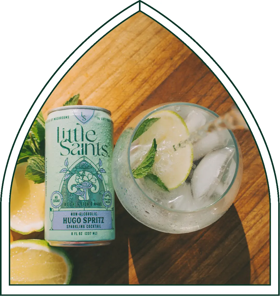
The specifics that make the parallel concrete include a stated 100mg mushroom dose per serving, extracts at a minimum of 70% beta glucan documented by supplier certificates of analysis, USDA Organic mushrooms grown in California and extracted with ultrasound rather than solvents, and the extract holding GRAS status, the FDA's standard of generally recognized as safe for an ingredient used in food. Most functional beverage brands publish neither a dose nor a potency figure. Little Saints publishes both.
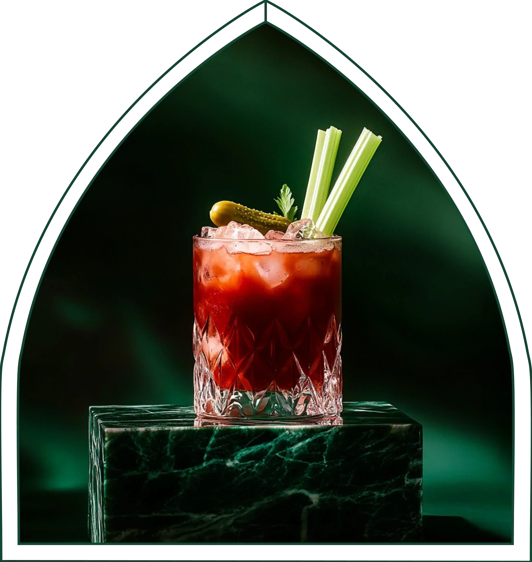
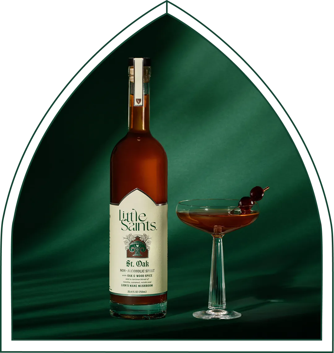
The product lines cover the occasion from two directions. The canned non-alcoholic cocktails, Classic Spritz, Hugo Spritz, Classic Margarita, Paloma, Old Fashioned, Mojito, and Negroni Spritz, carry zero grams of sugar and five calories per can. The non-alcoholic spirits St. Ember, St. Oak, and St. Juniper carry zero grams of sugar with no sweeteners of any kind. They are built on oil-based craft extracts so they mix 1:1 in a classic cocktail spec, where two ounces replaces two ounces with no over-pouring required.
The behavior that connects this to the topic of this guide is zebra striping across a night, alternating alcoholic and non-alcoholic drinks. NIQ puts it at 47% of on-premise visitors mixing alcoholic and non-alcoholic options in the same occasion, with 93% of non-alcohol buyers also purchasing alcohol. The non-alcohol shopper is the same customer buying across both sets, and Little Saints is built for the round that would otherwise have been a water.

These statements have not been evaluated by the FDA. Little Saints products are not intended to diagnose, treat, cure, or prevent any disease.
Frequently Asked Questions
Do The Two Zebra Stripe Colors Need To Contrast With Each Other?
Generally no. WCAG 1.4.3 Contrast (Minimum) governs the contrast between text and its background, not between two background colors. When stripes are used only to help the eye track across a row, with no information encoded in the stripe itself, they are decorative. Decorative elements are exempt from contrast requirements under both 1.4.3 and 1.4.11. The text sitting on each stripe must still meet 4.5:1 against that stripe's background for normal text, or 3:1 for large text. When the stripe is the only signal conveying a meaningful state such as grouping, selection, or a data series, WCAG 1.4.11 applies and the stripe must meet 3:1 against its adjacent background.
What Contrast Ratio Do Table Rows Need?
As covered in the contrast ratio section, text must meet 4.5:1 against its row background for normal text and 3:1 for large text defined as at least 18pt, approximately 24px, or 14pt bold, approximately 18.5px. The stripe colors themselves do not need to meet any ratio against each other unless the stripe carries meaning. When it does, WCAG 1.4.11 requires 3:1 between the stripe and its adjacent background. These thresholds are exact. A computed ratio of 4.499:1 does not satisfy the 4.5:1 requirement.
What Happens To Zebra Stripes In High-Contrast Mode?
Forced-colors mode and OS high-contrast themes strip or remap author-defined background colors. The browser replaces author-defined fills with system colors, and zebra stripes implemented as background fills will not render. Tables must remain usable without them.
The fix is structural:
- Add a border-bottom to each row so the browser has a boundary to work with.
- Use adequate vertical padding so rows remain visually distinct.
- Use semantic table markup with proper thead, tbody, tr, th, and td elements so the browser applies appropriate system color treatment.
- Use the @media (forced-colors: active) block with system color keywords like Canvas and CanvasText to restore lost boundaries explicitly.
Why Do My Zebra Stripes Disappear In PDF Export?
As noted in the spreadsheet section, Chromium's PDF output drops background colors by default as a print convention inherited from paper and ink economy. Apply print-color-adjust: exact, and the legacy -webkit-print-color-adjust: exact prefix, to the striped elements to preserve the fill. The screen stripe value is often too light for print, so a value like #F4F4F4 may render as near-invisible on paper. Darken the alternate row fill for the print stylesheet, or substitute a border-bottom on each row as the primary separator. For Adobe InDesign exports, use PDF 1.4 or later to preserve live transparency and reduce the risk of light fills shifting during flattening.
Does Zebra Striping Affect Accessibility Audits?
Zebra striping affects audits through contrast and through behavior in forced-colors mode. If text contrast against either stripe color falls below 4.5:1 for normal text or 3:1 for large text, the table fails WCAG 1.4.3, a Level AA requirement. If the table is audited in forced-colors mode and row separation depends entirely on background fills, the table will fail a usability check even if it passes automated contrast tools. Automated scanners typically measure text-to-background ratios and may not account for forced-colors mode, so manual testing in a Windows Contrast Theme is required to catch the second failure mode. Ensure row separation survives color removal through borders, padding, and semantic markup before the audit.
Conclusion: Verifiable Values Across Every Surface
Across light mode, dark mode, forced-colors mode, charts, and spreadsheets, the same rule holds: stripes are decorative unless they carry meaning. The contrast requirements follow from that distinction.
The two stripe colors generally do not need to contrast with each other. The text must meet 4.5:1 against whichever stripe it sits on. When the stripe carries meaning, it must meet 3:1 against its adjacent background. Tables must remain usable when stripes are stripped entirely.
Every value in this guide is stated and verifiable. Little Saints applies that same discipline to what you drink, with documented mushroom doses and beta glucan content on the label.
The statements made on our website have not been evaluated by the Food and Drug Administration, Our products are not intended to diagnose, treat, cure or prevent any disease. If you are pregnant, nursing, taking any medications or have any medical conditions, consult your doctor before use.